
Bioinformatics Tools for COVID-19 Management

Welcome back to our little corner of the bioinformatics universe. Much has happened since our last column. COVID-19 has altered the fabric of society and imposed cultural adaptations that will not be soon forgotten. I’ve prepared this column to provide access to, and assistance with, a few resources that may be helpful to other physicians managing COVID-19 infection.

The first is a simple database of agents known or suspected to possess anti-coronavirus activity. It can be found here: https://www.datapunk.net/covid19/antivirals.pl.
The second is a COVID-19 tracker app with analysis and polypharmacy indications. I built this tool to allow for some degree of stratification based on symptom patterns and chronographics. It uses some AI, Principal Components Analysis and machine learning to offer possible high-information-value combinations of therapeutics. We’ll start by looking at a demo version of the final analytics screen. Point your browser to this address: https://www.datapunk.net/covid19/corona_analysis.pl?demo.
This link will take you to a demo of the form output. It looks like this:
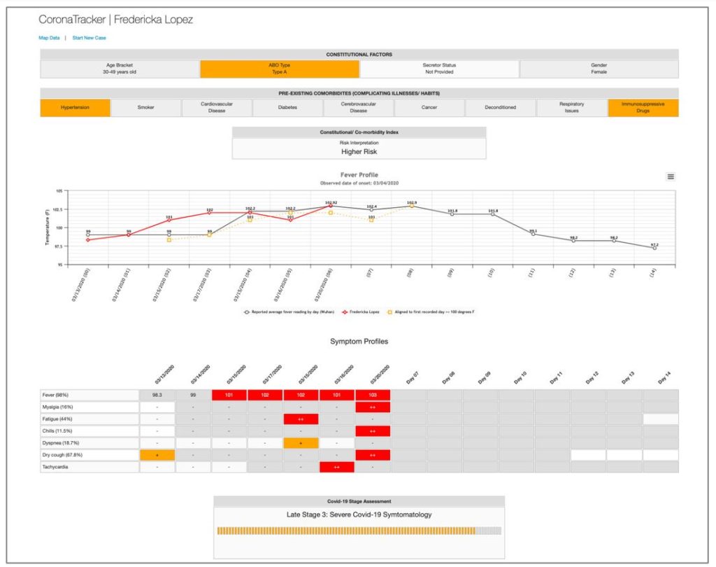
Our subject, Fredricka Lopez (not a real person) has been tracked for several days after developing some worrying symptoms. At the top are some risk factors/comorbidities she has shared with us. The variations associated with increased risk are colored orange. For one, she is blood group A, which appears to be a risk factor for complications, perhaps due to the known links with this blood type and blood viscosity (although as I wrote in one of my blogs, the main issue with blood type A and coronavirus infection may be the inability to produce anti-A antibodies). She also lists hypertension and the use of immunosuppressive medications, both additional risk factors. With this information the program calculates her risk as ‘higher,’ not the highest level of concern, but significant, nonetheless. For this function we use the naïve Bayes classifier AI algorithm we discussed last column.
Below this we find a fever map that charts her temperature (red line) and superimposes it over the fever trends that were observed from the Wuhan outbreak. This gives a good idea of how the natural evolution of the infection will play out. If the client reports a 100 degree say, the program will slide the client’s temperature data over so that their first 100 degree day coincides with the first 100 degree day in the Wuhan data. This will appear as a dotted orange line. Fever graph lines can be toggled on and off by clicking on each of the colored keys below the Fever Profile graph.

Next, we see a table that profiles her symptoms over the same period of time. Where the symptoms appear to trend in line with the Wuhan data, the boxes are colored red. Orange boxes indicate positive symptoms have been observed, but these that have not been typically observed at this point in the disease chronology. Grey boxes indicate days where that symptom has been observed; white boxes are when it hasn’t.
At this point the analytics take over and the program hazards a guess at the likely stage/severity of the infection. Stages are classified as:
- Stage 0: Asymptomatic or Prodromal
- Stage 1: Mild COVID-19 Symptomatology
- Stage 2: Moderate COVID-19 Symptomatology
- Stage 3: Severe COVID-19 Symptomatology
- Stage 4: Extreme COVID-19 Symptomatology
These stages are important with regard to what follows, which is to try and arrive at some rational stage-specific polypharmacy. However, first you’ll need to tick a small box that you agree to not get too mad at me if something goes wrong from this point on. Feeling lucky?
Okay, so we’ve ticked the box and you are hanging ten with the program. Due to the miracle of prestidigitation, we see a screen that looks something like this:
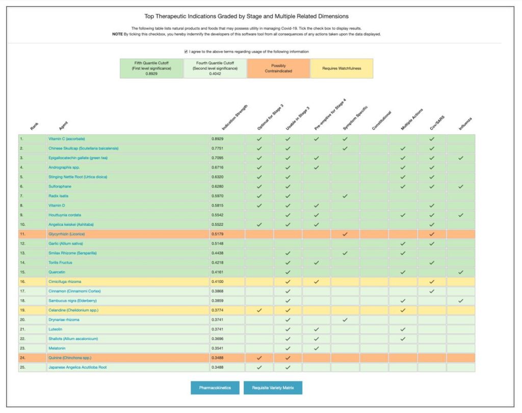
This table ranks a variety of natural products based upon their mechanism of action, evidence, and applicability of use at this stage of the infection. Data is split by quantile (dark green: first level quantile cutoff; light green: second level quantile cutoff). Orange indicates agents with mixed safety record; yellow those requiring some degree of watchfulness. The top row highlights some of the classifier results for the each agent; if applicable the box for that agent is checked.
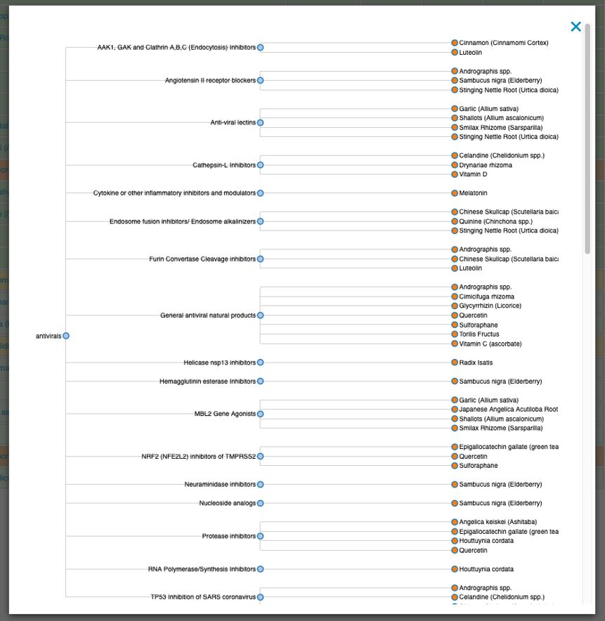
Below this table are two blue buttons. The first fires a popup that produces a dendrogram of the pharmacokinetics associated with this stage and set of comorbidities, and the agents that possess those actions. This is for the folks who like to ‘roll their own’ when it comes to polypharmacy and therapeutic protocols.
The second button is for those who like a more cruise-controlled trip through the data. It fires up another popup, but this one uses an algorithm designed to optimize ‘requisite variety.’ This heuristic posits that If a system is to be stable, the number of states of its control mechanism must be greater than or equal to the number of states in the system being controlled. For us, this means that a combination of agents, in which each addresses a unique aspect of the pathophysiology, will perform better than a combination of agents that work by similar methods. Requisite variety is not easy to model. I choose to use a combination of an AI Bayes classifier algorithm and a form of multivariate analysis known as Principal Components Analysis (PCA). The Bayes classifier gave the functional ‘bins’ in which to drop out agents, whilst PCA imparted ‘orthogonality’ to the data.
I like to think of PCA like this: You are standing at the bow of a boat and have a net in your hands. There will be one point on the compass that by throwing your net in that direction you will capture the maximum amount of fish. That is the first principal component (PCA1) of the data. Now things get weird. It turns out that if you turn 90 degree in either direction (orthogonal to the first direction) you are guaranteed to nab the second greatest amount of fish. That is the second principal component (PCA2) of the data. PCA is a great way to segregate data and here we use it to create on the-fly polypharmacy synergism.
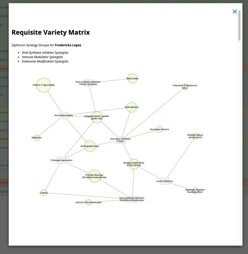
This popup has a lot of information in it. First it reports the highest-ranking synergist groups and draws a neat little network. Then it breaks down each group and ranks agents based on the evidence. I’ll leave you to explore the information in more depth by directly playing with the program.
Okay, now it’s time to see if this program can work for you. At the top of the screen click the link that says ‘Start A New Case.’ This will take you to the input form screen, which looks like this.

This is the top of the form, and it is where you put in the base data on the person you wish to track. It’s pretty self-explanatory. You can use any name and can opt to include geolocation data. Some fields are required, others aren’t.
At the bottom of the form is the daily symptom recorder. You’ll start at day ‘00’. Simply tick of any symptoms that are apparent, select a real date from the calendar date-picker, and record a temperature. You can add a few ‘diary-type’ remarks for the day as well.
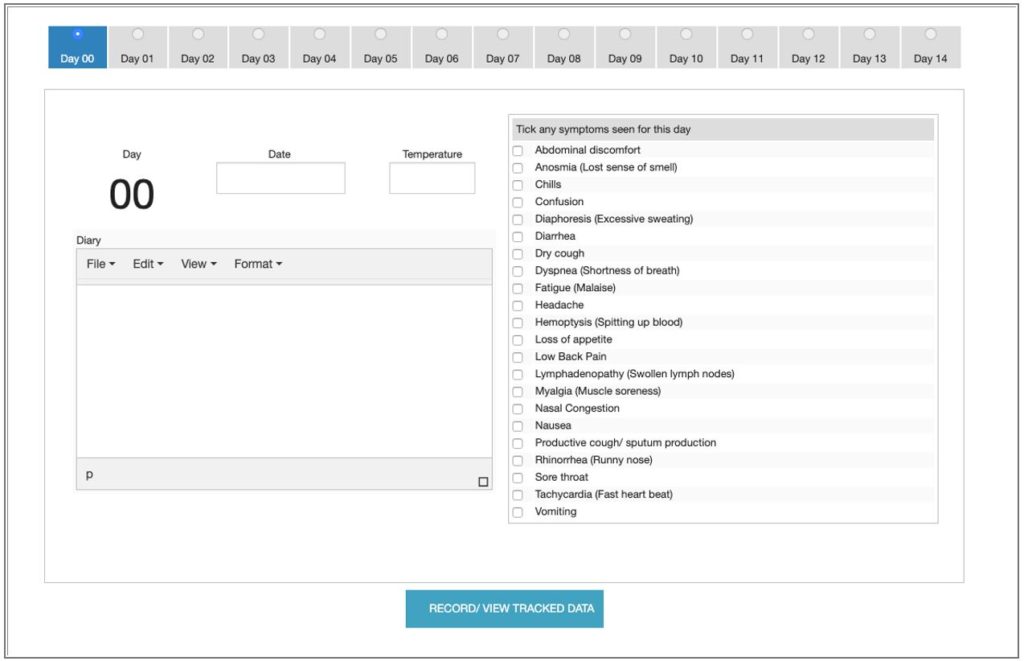
Pressing the ‘Record/ View Tracked Data’ button saves the data and sends you to the analysis page, which is where we started. However, unlike the demo, you’ll be provided with a URL in the upper left ‘Hard Link to Form (Bookmark This) ’ that lets you get back to the form and add more days to the data. This link should be bookmarked. I did not want to get involved in email verification and other ways to allow you to access the info. This is simple, but you do have to save the link someplace.

When you return to the form, it will move to day ‘01’ and you simply do it all over again. Ticking the radio button allows you to view prior days, and even adjust values should you need to. Again, just make sure you press the ‘Record/ View Tracked Data’ button to save the new data and move on to the analysis screen.
Well there you have it, a new tool to play with. I hope you find this app and the agent database helpful.
Finally, I’ve also been detailing some of my thoughts on the pandemic on my blog.
Feel free to stop by and leave a comment: https://dadamo.com/dangerous/category/covid19/.
Until next column, stay safe.

Peter D’Adamo is a distinguished professor of clinical medicine at the University of Bridgeport School of Naturopathic Medicine. His New York Times bestselling books have sold over 8 million copies and have been translated into over 75 languages. He is the developer of the acclaimed Opus23 genomic software suite and a variety of other generative apps that can be explored at www.datapunk.net.
In his spare time, he brings old VW Beetles back to life
at his garage on www.kdf20.com.